


Monday, 20 October 2008
A *reverse* “hockey stick�
Earlier today “JammieWearingFool†linked an opinion piece by the National Post’s Lorne Gunter, “Thirty years of warmer temperatures go poof.†The graph that came with the article immediately caught my eye. Here ’tis:
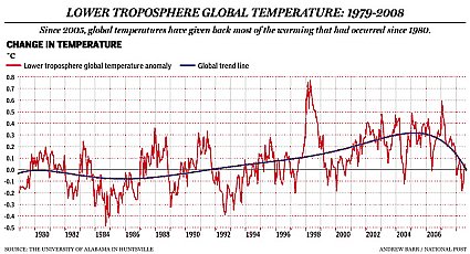
I know enough about statistics to know that I don’t know much about them. But... assuming that the data are accurately ploted, and assuming the trend line has been accurately calculated, my “eyeball†inspection says the trend line starts to curve downward in about 2003, first at an increasing rate, then stablilzing about mid-2007.
Now sensible people would say that you’ll see trends like this when you graph any natural phenomena that tend toward a normal value, and that we should shortly expect the trend to flip positive again. But the slope of the curve is pretty severely negative, so even with the trend turning positive we could expect to see negative figures on the chart for several years to come.
Gunter looks at the graph and says, “all of the rise in global temperatures since 1979 has disappeared.†Well, the data charted here doesn’t support that.[1] It will take several years’ worth of negative entries before that happens.
Still, it’s amusing to take that trend curve, and do a little extrapolation:
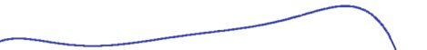
Which will, of course, make no difference whatever to some people.
Elsewhere:
Comments are disabled.
Post is locked.
Earlier today “JammieWearingFool†linked an opinion piece by the National Post’s Lorne Gunter, “Thirty years of warmer temperatures go poof.†The graph that came with the article immediately caught my eye. Here ’tis:
I know enough about statistics to know that I don’t know much about them. But... assuming that the data are accurately ploted, and assuming the trend line has been accurately calculated, my “eyeball†inspection says the trend line starts to curve downward in about 2003, first at an increasing rate, then stablilzing about mid-2007.
Now sensible people would say that you’ll see trends like this when you graph any natural phenomena that tend toward a normal value, and that we should shortly expect the trend to flip positive again. But the slope of the curve is pretty severely negative, so even with the trend turning positive we could expect to see negative figures on the chart for several years to come.
Gunter looks at the graph and says, “all of the rise in global temperatures since 1979 has disappeared.†Well, the data charted here doesn’t support that.[1] It will take several years’ worth of negative entries before that happens.
Still, it’s amusing to take that trend curve, and do a little extrapolation:
OMG, we’re all gonna freeze!
Which will, of course, make no difference whatever to some people.
Elsewhere:
Wikipedia Entry: Hockey Stick controversy
BBC (2004): Climate legacy of “hockey stickâ€
New Scientist (2008): The hockey stick graph has been proven wrong
Arizona Geology weblog (2008): UA scientist verifies ‘hockey stick’ climate model
-----BBC (2004): Climate legacy of “hockey stickâ€
New Scientist (2008): The hockey stick graph has been proven wrong
Arizona Geology weblog (2008): UA scientist verifies ‘hockey stick’ climate model
[1] AIUI, the ordinate actually plots the “global ∆T,†the month-to-month change in overall global temperature. Thus any positive value means “a global temperature increase over the previous month.†See here.
Posted by: Old Grouch in
In Passing
at
20:20:51 GMT
| No Comments
| Add Comment
Post contains 291 words, total size 5 kb.
71kb generated in CPU 0.0188, elapsed 0.0733 seconds.
51 queries taking 0.0619 seconds, 200 records returned.
Powered by Minx 1.1.6c-pink.
51 queries taking 0.0619 seconds, 200 records returned.
Powered by Minx 1.1.6c-pink.


